匠 (Takumi) より:
こんにちわ!日本工芸ウオッチャー&ガイドのtakumiです! ようこそ、九谷焼の鮮やかな色彩の世界へ!本シリーズでは「今夜加賀温泉に泊まるゲスト」から、地元でのアトラクションを聞かれた際の九谷焼への誘導&アテンド術をご紹介します。
工芸品に関する知識ゼロのお相手でも、専門用語を抑えた分かりやすい解説で「見てみたい!」から「欲しい!」と思っていただくまでのツボを凝縮しました。日々海外ゲストの対応に忙殺されて、準備に時間をかけられない前線の皆さまの即戦力になる英語表現と笑いのスパイスをお求めの際には、このボタンからチェックしてみてください!
\ 九谷焼ガイド全4シリーズ・現場で即使える情報をチェック /
4. 絵付け技法
匠のナビゲート:
九谷焼の真髄「上絵付け」の世界へようこそ。五彩の魔術から、宝石のような立体技法まで、その秘密を解き明かします。
\ ゲストの笑いも取れるかも!真面目な説明力と雑談力UPになる匠パート /
4.1 基本情報
絵付け技法のテクニックにフォーカスしたご説明する際に押さえておきたい基本ポイントです。いつも通り日英の順です。
《日本語》
- 上絵付けの基本構造 — 九谷焼の絵付けは、素地を高温で焼いた後に色絵具で文様を描き、再び焼成する「上絵付け」が中心。素地と絵付けの工程が明確に分かれている。
- 五彩(ごさい)の伝統色 — 赤・黄・緑・紫・紺青の五色を基調とし、職人は焼成後の発色を予測して色を調合する。九谷焼の深い色調はこの経験値から生まれる。
- 呉須(ごす)による線描き — 下書きにあたる青色の顔料「呉須」で輪郭線を描く技法。線の太さ・濃淡で作品の印象が大きく変わる。
- 細密描写の筆技 — 絵付師は数種類の極細筆を使い分け、髪の毛のような細線から面塗りまで自在に描く。筆圧と呼吸が仕上がりを左右する。
- 盛り(もり)技法の立体感 — 絵具を厚く盛り上げて立体的な模様を作る九谷焼特有の技法。指先の感覚で絵具量を調整し、宝石のような質感を生む。
- 塗り埋め(ぬりうめ)の緻密さ — 面を均一に塗りつぶす高度な技術。ムラなく塗るために筆の角度や速度を微調整する必要がある。
- 金彩・金襴手(きんらんで) — 絵付け後に金箔・金粉を施す豪華な装飾技法。加賀百万石の文化を象徴する華やかさを生み出す。
- 焼成による色変化の読み — 上絵具は焼成温度で色が変化するため、職人は「焼き上がりの色」を経験的に読み切る必要がある。
- 文様の象徴性 — 吉祥文様(松竹梅、宝尽くし、唐草など)や自然モチーフ(花鳥風月)には意味があり、訪日客にとって文化的背景の説明が喜ばれる。
- 作家性と自由表現 — 伝統文様だけでなく、現代作家は独自の色使いや構図で新しい九谷焼を生み出しており、「技法 × 個性」が作品価値を高めている。
《英語》
1. Overglaze painting as the core technique — Kutani ware decoration is mainly done through overglaze painting: the porcelain body is fired first, then painted with colored pigments, and fired again. The forming and painting stages are clearly separated.
2. The traditional Five Colors — Red, yellow, green, purple, and dark blue form the foundation of Kutani color palettes. Artisans mix pigments while predicting how they will change during firing, creating the signature depth of Kutani colors.
3. Gosu blue linework — Outlines are drawn with gosu, a cobalt-blue pigment. The thickness and shading of these lines dramatically influence the final impression.
4. Ultra‑fine brushwork — Artisans use multiple ultra‑fine brushes to create hair‑thin lines and broad color fields. Brush pressure and breathing control the precision of the design.
5. Raised “Mori” technique — A unique method where pigments are applied thickly to create raised, jewel‑like textures. The artisan controls pigment volume with delicate fingertip sensitivity.
👤英語連続1-5
6. Meticulous color‑filling — Large areas are filled with perfectly even color. Achieving a smooth, uniform surface requires subtle adjustments in brush angle and movement.
7. Gold decoration (Kinrande) — Gold leaf or gold powder is applied after painting, adding the luxurious brilliance associated with the Kaga domain’s artistic heritage.
8. Predicting color transformation in the kiln — Overglaze pigments change color depending on firing temperature. Skilled artisans must anticipate the final hues before the piece enters the kiln.
9. Symbolic motifs — Traditional motifs such as pine‑bamboo‑plum, treasure patterns, and floral or bird themes carry cultural meanings that visitors appreciate when explained.
10. Artistic individuality — Beyond tradition, contemporary artists incorporate personal styles, creating innovative expressions. The fusion of technique and individuality enhances the artistic value of Kutani ware.
👤英語連続音声6-10
Glossary:用語集(九谷の技法と美学編)
- overglaze painting ☛ 上絵付け(釉薬の上に色をのせる技法)
- form the foundation of ~ ☛ ~の基礎(土台)を形づくる
- signature depth ☛ (そのブランド特有の)象徴的な深み
- cobalt-blue pigment ☛ コバルトブルーの顔料(呉須など)
- dramatically influence the final impression ☛ 最終的な仕上がりの印象を劇的に左右する
- ultra-fine brushwork ☛ 超極細の筆さばき(筆技)
- hair-thin lines ☛ 髪の毛ほどの細い線
- raised texture ☛ 盛り上がった質感(立体感)
- jewel-like textures ☛ 宝石のような質感
- delicate fingertip sensitivity ☛ 繊細な指先の感覚
- meticulous color-filling ☛ 緻密な塗りつぶし(面塗り)
- perfectly even color ☛ 完全に均一な色
- luxurious brilliance ☛ 豪華絢爛な輝き
- artistic heritage ☛ 芸術的な遺産(文化的継承物)
- anticipate the final hues ☛ 最終的な色合い(焼き上がりの色)を予測する
- symbolic motifs ☛ 象徴的な文様(意味を持つモチーフ)
- carry cultural meanings ☛ 文化的背景(意味)を宿している
- innovative expressions ☛ 革新的な表現
- fusion of technique and individuality ☛ 技術と個性の融合
4.2 インバウンドの視点
実際にインバウンドからよく聞かれる質問元にした想定QAです。九谷焼の多様なデザインを見て彼らが素朴に感じるであろう疑問です。👉言及している具体的な技法名は、Q1: 上絵付け(焼成)、Q5: 金襴手(金彩)、Q6: 盛り(Mori)、Q8: 呉須(線描き)です。
《日本語》
- Q1:この色、なんでこんなに深いの?絵具が特別? A:実は、塗った時の色と焼き上がりの色が全然違うんです。職人は“焼いた後の色”を頭の中で計算して調合しています。まるで未来予知です。
- Q2:この線、まっすぐすぎて定規使ってる? A:定規は使いません。筆を“空中で固定”するようにして、手を震わせずにスーッと引きます。職人の手は、もはや精密機械です。
- Q3:なんで同じ赤でも濃いところと薄いところがあるの? A:筆圧と水分量の調整で濃淡を作っています。ほんの数ミリの動きで表情が変わるので、まさに“筆の呼吸”です。
- Q4:この細かい模様、スタンプじゃないの? A:全部手描きです。スタンプに見えるほど正確に描けるのが九谷の絵付け師のすごさなんです。
- Q5:どうして金が剥がれないの?普通の金箔と違うの? A:焼き付ける温度や接着剤の調合が特別なんです。金箔を貼るだけでなく、窯で“定着”させているので丈夫なんです。
- Q6:この盛り上がった部分、乾くまで崩れないの? A:崩れないギリギリの硬さに調整した絵具を使っています。ケーキのクリームより難しい“盛りの世界”です。
- Q7:どうしてこんなに細かい模様を何時間も描けるの?疲れない? A:疲れます(笑)。でも、職人は“集中スイッチ”が入ると時間を忘れるんです。気づいたら夕方、なんてことも。
- Q8:この青い線(呉須)、なんでにじまないの? A:にじまないように水分量を極限まで調整しています。紙よりも難しい“陶器の上の水分コントロール”です。
- Q9:どうして左右対称に描けるの?下書きしてる? A:下書きは最小限。左右対称は“頭の中のガイドライン”で描いています。まるで脳内にCADが入っているようなものです。
- Q10:この模様、どこまでが伝統で、どこからが自由なの? A:伝統文様の“型”はありますが、色や構図のアレンジは作家次第。伝統と自由のバランスが、九谷焼の面白さなんです。
《英語》
Q1: Why are these colors so deep and rich? Are the pigments special? A: The funny thing is, the colors look totally different before firing. Artisans mix pigments while imagining the final color after the kiln. It’s almost like color prediction magic.
Q2: These lines are perfectly straight. Do they use a ruler? A: No ruler at all. They hold the brush steady in mid‑air and pull the line in one smooth motion. Their hands are basically precision instruments.
Q3: Why does the same red look darker in some places and lighter in others? A: It’s all in the brush pressure and water control. A tiny shift in movement changes the shading. It’s literally “the breathing of the brush.”
Q4: These tiny patterns look like stamps. Are they printed? A: All hand‑painted. The fact that they look stamped shows just how steady and accurate Kutani painters are.
Q5: This gold part— is it real gold? And why doesn’t it peel off? A: Yes, it’s real gold leaf or gold powder. It’s not just glued on; it’s fired in the kiln so the gold bonds firmly to the surface.
Q6: These raised decorations—don’t they collapse before drying? A: The pigment is mixed to the perfect thickness so it holds its shape. “Mori” painting is like decorating a cake, but ten times harder.
Q7: How can artisans paint such tiny details for hours? Don’t they get tired? A: They do! But once they enter their “focus mode,” time disappears. Many look up and realize it’s already evening.
Q8: This blue outline doesn’t bleed at all. How is that possible? A: They control the water content with extreme precision. Painting on ceramic is much harder than painting on paper.
Q9: How do they make everything perfectly symmetrical? Do they sketch it first? A: Only minimal sketching. Most symmetry comes from the artisan’s internal “guide lines.” It’s like having CAD software inside their brain.
Q10: Which parts follow tradition, and which parts are the artist’s own style? A: Traditional motifs exist, but colors and composition are up to the artist. Kutani ware is all about balancing tradition with personal creativity.
Glossary:用語集(九谷の魔法と精密機械編)
- deep and rich colors ☛ 深みとコクのある色
- look totally different before firing ☛ 焼成前は(色が)全く違って見える
- color prediction magic ☛ (焼き上がりの)色の予測マジック
- hold the brush steady in mid-air ☛ 筆を空中で(震えさせず)固定する
- in one smooth motion ☛ 滑らかに一息で(線を引く)
- precision instruments ☛ 精密機械(精密測定器)
- brush pressure and water control ☛ 筆圧と水分のコントロール
- tiny shift in movement ☛ わずかな動きの変化
- breathing of the brush ☛ 筆の呼吸
- just how steady and accurate ☛ いかに(手が)安定し、正確であるか
- bonds firmly to the surface ☛ 表面に強固に固着(結合)する
- raised decorations ☛ 立体的な装飾(盛り)
- holds its shape ☛ (崩れずに)形を保つ
- ten times harder ☛ 10倍難しい(困難である)
- focus mode ☛ 集中モード(ゾーンに入る状態)
- doesn’t bleed at all ☛ まったくにじまない
- extreme precision ☛ 極限の精密さ
- perfectly symmetrical ☛ 完全に左右対称な
- internal “guide lines” ☛ (職人の)頭の中にあるガイドライン
- balancing tradition with personal creativity ☛ 伝統と個人の創造性のバランス
4.3 笑いが取れるかも?説明例
Q1. 九谷焼の「呉須」とは?
What is Kutani ware’s gosu?
1-6は呉須に関する説明パート、7-12は青色に関する説明パート、13以降はいつものおふざけパートです。今回は様々な青色に関する英語表現を織り込んでみました。
- It is the first set of lines drawn on the pure white porcelain surface to form the framework of the design. 白い素地の上に最初に描かれる線で、デザインの骨格をつくる大切な工程です。
- When applied, the pigment looks dull and dark, but after firing in the kiln it transforms into a vivid cobalt blue—a truly remarkable material. 塗った直後はくすんだ黒っぽい色をしていますが、窯で焼くと鮮やかなコバルトブルーに変化して、まさに魔法のような材料です。
- This deep, vibrant blue becomes a calm foundation that beautifully enhances the bright five-color palette of Kutani ware. この深く澄んだ青は、九谷焼の五彩を引き立てる静かなベースカラーとなり、作品全体の印象を大きく左右します。
- The impression of a piece changes dramatically depending on the artisan’s brush pressure, from hair‑thin lines to bold strokes, and the shading created by variations in thickness. 線の太さや濃淡は、絵付師の「筆圧」によって生まれます。髪の毛のように細い線から力強い太線まで、わずかな筆の動きで表情が変わり、厚みの違いによる陰影が作品に奥行きを与えます。
- These cobalt lines also act as a barrier, preventing the vivid overglaze colors applied later from mixing. また、このコバルトの線は、後から塗る鮮やかな上絵具が混ざらないようにする“境界線”としての役割も果たします。
- In the past, gosu was an expensive material made from precious imported pigments. かつて呉須は、海外から輸入される高価な顔料でした。
- Perhaps for that reason, the Japanese have long cherished blue tones and incorporated countless shades of blue into daily life. おそらくその理由から、日本人は古くから青色を大切にし、生活の中に無数の青のグラデーションを取り入れてきました。
- The most iconic is indigo. 最も象徴的なのが藍色です。
- During the samurai era, indigo‑dyed kimonos and shop curtains became part of everyday culture, and this beautiful color is now known worldwide as “Japan Blue.” 武士の時代には、藍染めの着物や暖簾が庶民の暮らしに深く根づき、この美しい色は今では“ジャパン・ブルー”として世界に知られています。
- The skies and seas in ukiyo‑e prints were also depicted in this hue. 浮世絵に描かれた空や海も、この藍の色でした。
- Today, deeper navy blues remain popular, while even darker indigo appears in the rich blue of Kutani porcelain. 現代でも、深く落ち着いた紺色は根強い人気がありますし、さらに深い藍色は九谷焼の濃いブルーにも通じています。
- Everyday life is also filled with lighter blues: pale blue summer yukata, refreshing sky‑blue glassware, soft light‑indigo hand towels, and jewel‑like lapis‑colored ceramics. 日常生活も淡い青で溢れています。淡いブルーの夏の浴衣、涼しげなスカイブルーのガラス器、柔らかな薄藍の手ぬぐい、宝石のような瑠璃色の陶磁器。
- Blue has always been a comforting presence in Japanese life. 青は常に、日本人の生活において安らぎを与える存在でした。
- But recently, the English phrase “feeling blue” has become common in Japan, and many young people associate blue with sadness. ところが最近は、英語の “feeling blue” が広まり、「ブルー=落ち込む」というイメージを持つ若い人も増えています。
- When I feel blue, I remind myself of all the beautiful shades of blue cherished in Japanese culture. そんなとき、私は日本人が大切にしてきた“青の世界”を思い出すようにしています。
- It really lifts my spirits. すると、本当に気持ちが軽くなるのです。
- The blue blew away my blue feeling! 青が、ブルーな気分を吹き飛ばしてくれました。
Glossary:用語集(呉須と青のグラデーション編)
- form the framework of the design ☛ デザインの骨格(輪郭)をつくる
- pigment looks dull and dark ☛ 顔料(塗った直後)がくすんで暗く見える
- transform into a vivid cobalt blue ☛ 鮮やかなコバルトブルーに変化する
- beautifully enhance ~ ☛ ~を美しく引き立てる
- brush pressure ☛ 筆圧
- hair-thin lines to bold strokes ☛ 髪の毛ほどの細い線から力強い太い線まで
- act as a barrier ☛ 境界線(バリア)としての役割を果たす
- cherish blue tones ☛ 青の色調を大切にする(慈しむ)
- countless shades of blue ☛ 無数の青のグラデーション(陰影・色合い)
- indigo-dyed kimonos ☛ 藍染めの着物
- depicted in this hue ☛ この色合い(色軸)で描かれている
- lapis-colored ceramics ☛ 瑠璃色の陶磁器
- comforting presence ☛ 安らぎを与える存在
- associate blue with sadness ☛ 青を悲しみと結びつけて考える
- lift one’s spirits ☛ (人の)気分を高揚させる、元気づける
- blew away my blue feeling ☛ (ダジャレ)青色が私のブルーな気分を吹き飛ばした
Q2. 九谷焼の模様がこんなに違うのはなぜ?
Why are the painting patterns on Kutani ware so different?
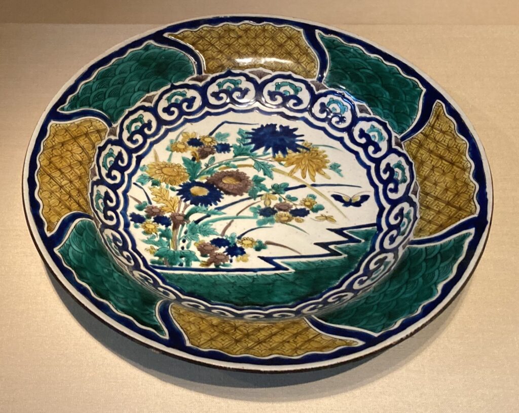
1-10まで説明(絵付けに関する歴史、特徴)パート、11以降はいつものおふざけパートです。今回は皿に関する英語表現を多く織り込みました。👤英語音声は豆皿の様にDishy(魅力的)な米国女性話者です。
- The diversity and complexity of its decoration is one of the defining features of Kutani ware. 九谷焼の大きな特徴は、その装飾の多様さと複雑さにあります。
- It reflects not only its design quality but also its spirit. これはデザイン性だけでなく、九谷焼が受け継いできた“精神”そのものを物語っています。
- Early Kutani ware from about 400 years ago was already vivid and bold, but production mysteriously stopped a few decades later. 約400年前の初期九谷も非常に鮮やかでしたが、数十年で謎のように生産が途絶えました。
- Its revival about a century afterward shaped the future of Kutani ware. そして約100年後の復興が、九谷焼の運命を決定づけました。
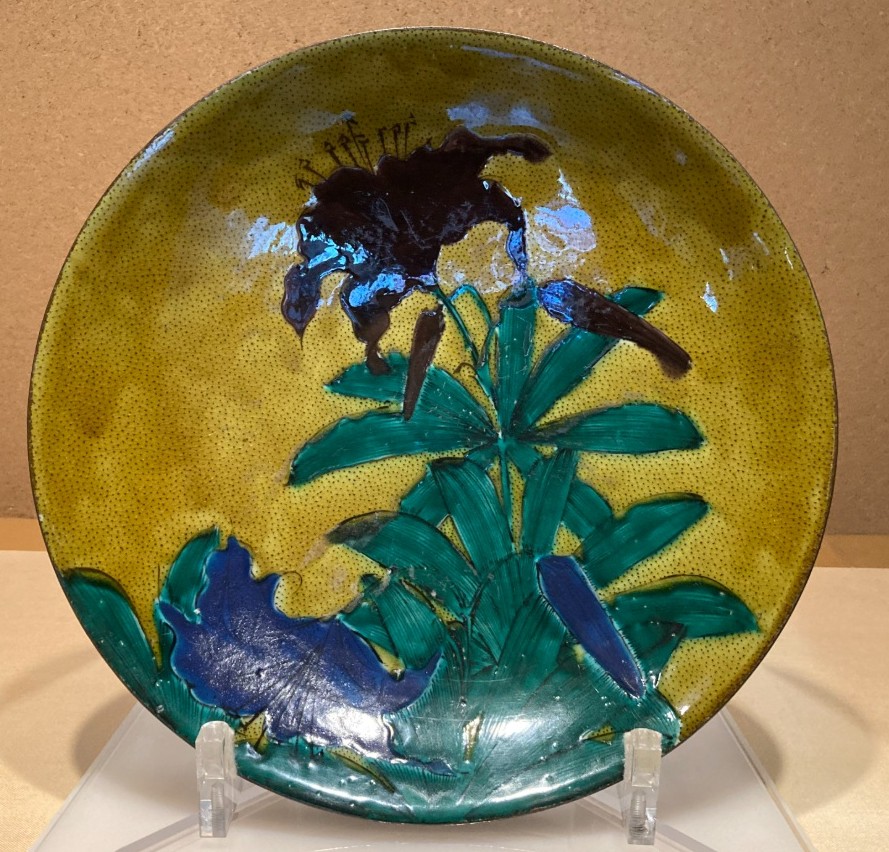
- The Yoshidaya style, which revived the early Kutani aesthetic and refined it further, is known for its blue‑and‑green palette—famously “without using red.” 初期九谷の意匠を復活させ、さらに洗練させた「吉田屋」は、青と緑を基調とし、“赤を使わない”ことで知られています。
- After that kiln closed, the Iidaya style rose to prominence with its striking use of red and gold. その後、吉田屋窯が閉じると、赤と金を大胆に使う「飯田屋」が台頭しました。
- In this way, each generation of talented painters created its own intricate world, eventually forming the brand known today as “Japan Kutani.” このように、時代ごとに才能ある絵付師たちがそれぞれの世界観を広げていき、やがて「ジャパン・クタニ」というブランドが形づくられていきました。
- This brand is instantly recognizable for its brilliance, opulence, and dense, information‑rich designs. 豪華絢爛さ、圧倒的な情報量、一目で“九谷”とわかる存在感がその特徴です。
- Kutani decorative plates are especially popular, whether hung on walls or displayed on stands. 特に人気なのは、壁に掛けたり台に飾ったりできる飾り皿です。
- At the same time, cute and affordable small dishes are also in high demand. 一方で、手頃でかわいい小皿も大人気です。
- But this creates a small challenge for interpreter guides. ただし、ここで通訳ガイドにはちょっとした悩みが生まれます。
- Large pieces can be called “plates,” and small ones “dishes,” but both words also mean “food,” so misunderstandings can happen. 大きいものは“plate”、小さいものは“dish”と言えますが、どちらも“料理”という意味もあるため、誤解が生まれやすいのです。
- When someone asks, “What’s the dish?” while pointing at a small plate of food, are they asking about the plate, the food, or making a clever joke based on a trendy expression? たとえば、小皿に盛られた料理を見て「What’s the dish?」と聞かれたとき、それは“皿”のことなのか、“料理”のことなのか、それとも最近の流行語を使ったジョークなのか……判断が難しいのです。
- And if a painter looks at a huge plate of food and says, “We have a lot on our plate,” do they mean the feast—or simply how busy they are? さらに、絵付師が大皿いっぱいの料理を見て「We have a lot on our plate.」と言った場合、それは“ごちそう”のことなのか、それとも“忙しさ”のことなのか?
- Busy painting intricate designs, of course! もちろん、細かい模様を描くのに忙しい、という意味です!
Glossary:用語集(九谷の流派と「皿」の表現編)
- diversity and complexity ☛ 多様さと複雑さ
- defining features ☛ 決定的な特徴
- mysteriously stopped ☛ 謎のように(生産が)途絶えた
- shaped the future of ~ ☛ ~の運命(将来)を決定づけた
- revived the aesthetic and refined it further ☛ 美意識を復活させ、さらに洗練させた
- known for its blue-and-green palette ☛ 青と緑の配色(調合)で知られる
- rose to prominence ☛ 台頭する、一躍有名になる
- striking use of red and gold ☛ 赤と金の際立った(印象的な)使い方
- instantly recognizable ☛ 一目でそれとわかる
- opulence and dense, information-rich designs ☛ 豪華絢爛さと、密度が高く情報の多い(描き込まれた)デザイン
- hung on walls or displayed on stands ☛ 壁に掛けたり、台に飾ったりする
- dishy ☛ (形容詞)魅力的な、色っぽい(※小皿のDishとかけた表現)
- What’s the dish? ☛ (慣用句)「何が起きてるの?」「最新の噂話は何?」
- have a lot on one’s plate ☛ (慣用句)やるべきことが山積みである、手一杯である(※直訳:皿の上にたくさんのものがのっている)

御礼🔶あとがき

最後までお読みいただきありがとうございます!加賀温泉郷や金沢の街歩きで「今夜どこへ行こう?」「何か面白い工芸品はある?」と聞かれた際、鮮やかな九谷五彩のストーリーとちょっとした笑いのスパイスが、ゲストの心をつかむ一助となれば幸いです。本シリーズへのご感想や、現場でのガイド解説に関するご相談などがありましたら、下記よりお気軽にご連絡ください。